Tag: Elephant Design

  • More jury chairs for Abby 2023 announced

    By Our Staff


    More jury chairs for Abby One Show 2023 have been announced. Valerie Pinto, CEO, Weber Shandwick, Ahmed Aftab Naqvi, Global CEO & Co-founder, Gozoop and Ashwini Deshpande, Co-Founder and Director of Elephant Design, join as Jury Chair for Public Relations category, Jury Chair of Mobile Category, and Jury Chair of Design category respectively.


    Said Ashwini Deshande: “It is an absolute privilege to be judging the Design category at Abby One Show Awards. India is a unique playground for brands and consumers. I define Design as a creative way of solving a challenge.  I am hoping to see great work based on real life insights that solve a challenge in a delightful way.”


  • Elephant Design partners Tata Sampann for dry fruits

    By Our Staff


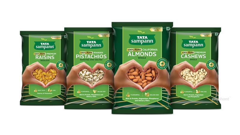
    Tata Sampann has roped in Elephant Design for the packaging and brand-building activity of its dry fruits offering.


    About the agency engagement, Deepika Bhan, President, Packaged Foods, Tata Consumers Limited said: “Elephant Design brought to life our vision on the dry fruit category launch. It was a challenging brief and a challenging timeline, and they delivered seamlessly. Project ownership from both the design and client servicing team is their winning formula”.


    Added Ashwini Deshpande, Co-founder & Director, Elephant: “As custodians of the brand, we have managed a lot of flexibility within the visual system for specific categories that not only carry forward the brand equity of Tata Sampann, but also stand out within their respective categories. For Dry Fruit range, we wanted to emphasize on careful selection of best quality. The packaging also needed to be strong on e-commerce creating balance between brand & product imagery.  Two hands forming a heart shaped window seemed to be the perfect semiotics to go with.”


  • Ashwini Deshpande @ Emirates Poster Fest

    By Our Staff


    Ashwini Deshpande, Co-Founder & Director, Elephant Design, was one among the select designers globally, to create a poster by the Emirates International Poster Festival on the theme, ‘Connecting Minds, Creating the Future’, in celebration of human brilliance and achievement. EIPF invited 192 designers from 52 countries to reflect on the theme.


    Commenting on her participation through The Design Alliance Asia, Deshpande said: “As we have lived through ‘virtual’ relationships, transactions and even art, I wanted to express the magic that can only happen in the real world. Discovering how ‘Yellow’ of hope and ‘Blue’ of vastness merges to become the green of prosperity can only be experienced as water colours connect on paper. My interpretation of the theme was an abstract version of Buddha which is pure serendipity as I believe in the ‘middle path’ as described by Gautam Buddha.”


  • Elephant Design continues to bolster leadership team

    By Our Staff


    Elephant Design agency has further bolstered its design team with the appointment of Elodie Nerot as Lead Designer. Nikhil Phadke, alumnus of Savannah College of Art and Design (USA) and Yugandhara Dalvi, who has an applied arts background, will continue to deliver creative impetus as lead designers along with Elodie.


    Elodie Nerot
    Elodie Nerot

    Sharing more about her new role, Nerot said: “I have lived in India for nearly a decade now and I’m fascinated about the innovation and development of the beauty and consumer goods segments here. After working in different cultures, I am glad to be back and share a creative and challenging journey with talented and experienced designers at Elephant”.


    Ashwini Deshpande
    Ashwini Deshpande

    Touching upon the future plans of the company, Ashwini Deshpande, Co-founder Director Elephant, added: “Having Elodie back at Elephant feels really special and reiterates our belief in Elephant culture. Our team has never been stronger, and we are so ready to explore every exciting opportunity to make a difference. But we are not done yet …expect to hear about further augmentation soon!


  • Elephant Design bolsters top deck

    By Our Staff


    Design agency Elephant Design has announced two new appointments at the senior level. This is to further augment its teams across multiple locations. Nidhi Isaac, alumna of the School of The Art Institute Chicago, joins Elephant Design as Director – Brand & Design. Kedar Parundekar, alumnus of Schulich School of Business (Canada), who has been with Elephant Design leading business development for seven years, has been elevated to the position of Vice President – Business & Strategy.


    Ashwini Deshpande
    Ashwini Deshpande

    Said Ashwini Deshpande, Co-founder Director Elephant: “True to my word at the start of the pandemic, we have become location agnostic in the real sense, and I am taking the liberty to hire exceptional talent irrespective of where they work from. I am very excited to welcome Nidhi who comes with rich experience in service design & brand architecture consulting across multiple business segments. Kedar is an asset to our organisation and his new role will give him more flexibility to create pathbreaking strategies. But we are not done yet …expect to hear about further augmentation soon!”


    Nidhi Isaac
    Nidhi Isaac

    Said Isaac: “I see this as an exciting opportunity to create meaningful transformations for brands and businesses, providing immense value for the new Indian consumer.”


    Kedar Parundekar
    Kedar Parundekar

    Added Parundekar: “It’s an honour to have been a part of Elephant’s growth story till now. The last few years have been filled with some really exciting work. I am looking forward to helping build a strong team of creative professionals and thought leaders at Elephant to be able to strengthen our strategic offering even further.”


  • Ashwini Deshpande to lead design jury at London International Awards

    By Our Staff


    Ashwini Deshpande
    Ashwini Deshpande

    Ashwini Deshpande, Co-Founder and Director, Elephant Design, has been named as one of the jury presidents for the London International Awards (LIA). Deshpande will lead the Design and Package Design Jury. Deshpande is the only Indian among the 16 Jury Presidents selected for the London International Awards.


    The jury members at the London International Awards (LIA) members are required to evaluate every piece of work individually during the first round and meet with other presidents online next to decide on the winners once shortlists have been decided. Created for creatives, the LIA is in its 12th year and will reward the best creative work globally. It has also introduced two standalone competitions this year – ‘Creative Use of Data’ and ‘Transformative Business Impact’.


    Said Deshpande: “I am excited to be leading the Design and Packaging Design Jury for London International Awards. LIA is special as it is run by an all-women crew. Would love to see some comforting, classic and timeless work especially because of the times we are going through. Looking forward to some refreshing and responsible work as well”.


  • Paper Boat bags packaging award at The India Story Design Awards

    By A Correspondent


    Celebrating India’s greatest design thinkers, practitioners and educators from established businesses to emerging practices, the India Story Design Awards presented Elephant Design with an award in the Packaging Design category for its work on Paper Boat


    Pune-based Elephant Design had helped shape the packaging design for the popular soft drinks brand – right from contributing to its name, story, packaging structure, brand and visual identity.


  • Elephant Design develops Tata Unistore identity

    By A Correspondent


    Pune-based Elephant Design has done the naming, brand identity, visual language and look-and-feel of all interfaces for Tata CLiQ, the Tata Industries-incubated e-commerce business venture that was unveiled on Tuesday.


    Tata CLiQ will open to consumers on May 27 across its website, mobile site and mobile apps, the company said in a statement. At launch, Tata CLiQ will offer consumers apparel, electronics and footwear products. Over the next few months, it plans to expand by adding more categories, brands and features.


    “Clique and Click came together to form the perfect name for our platform, which curates authentic and exclusive products for customers with impeccable taste. A name that says shopping online is now so easy and trustworthy, that all it takes is a click. The ‘Q’ in the logo represents a magnifying glass—a visual representation of the brand’s focus on curating only the best brands and products,” said Ashutosh Pandey, chief executive officer (CEO), Tata CLiQ.


  • How Redesign can work for legacy brands!


    By Ashwini Deshpande


    Most often, we give less-than-due credit to iconic Indian brands. And there are quite a few, in every category of the FMCG sector. Tata Salt, Thums up, Parle G, Santoor, Good Knight, Britannia Marie Gold, Bisleri, Saffola, Real – the list goes on and on.


    These brands have a large market share. In most cases, they have remained in a leadership position despite the entry of competing international brands and changing consumer preferences. These brands can, therefore, be called ‘legacy brands’. They have managed to have loyal consumers for a sustained period; they are a part of their users’ lives, and they are irreplaceable for those who opt for them.


    Some Rebranding Challeng

    1. While Lacto Calamine had established credence with the woman who equated beauty with simplicity, it was time to ladder up to a larger and aspirational space; It was time to connect with a ‘self-assured’ woman who makes informed decisions. The brand needed alignment with the new positioning, without losing its core of simplicity. The challenge for Elephant was to create packaging that carried forward the simplicity from the past, but also looked believable as an advanced skincare solutions expert with a growing portfolio.


    2. Chandrika has been a trusted Ayurvedic soap for generations in India. The brand needed to reach out to a younger audience, while staying true to Ayurveda as its core story. Here, the challenge was multi-fold. Ayurveda was not associated with a contemporary lifestyle. And, as a concept, has been dogged by several misconceptions, one of them being slower efficacy. ‘Active Ayurveda’ as a proposition, resolved some of these issues. Ingredients like neem, lemon oil, patchouli oil etc were showcased to help demystify Ayurveda. Colours were changed to a fresher, more natural palette.


    3. Tata Salt, an undisputed leader and pioneer in the category, was ready for change as the brand needed to align with the progressive homemaker. We set out to solve two major challenges. One was to take up the position of being a ‘friendly’ expert, and another was to shake off the ‘me-too’ players who had completely emulated all the codes of Tata Salt packaging over years. First, the typography of the word ‘salt’ was humanised to add a layer of warmth to the trusted Tata logo. To reiterate confidence of the leader, images of food, people and such were removed from the earlier packaging, and a fresh outlook of a modern lifestyle was depicted through visuals of a modern kitchen setting. The colour palette was made more vibrant, but in alignment with its earlier portfolio. Graphics and mnemonics were designed to communicate relevant benefits in a clean and contemporary manner. This has clearly been very well accepted, as is evident from the market success as well as rankings of a recent survey of Most Trusted Brands, where Tata Salt has gone from No 16 to No 2.


    Legacy brands tend to set the standards in the marketplace. They are the very benchmarks for quality because of their emotive communication, for the rich history they continue to build on and, more importantly, for the way they keep up with emerging consumer expectations. Well before “we broke the internet” became a thing, a chant among marketers, these brands invoked conversations and active consumer voices. Their stories become folklore in the world of advertising and marketing.


    What is rarely discussed, however, is the way these legacy brands transform their visual identity to align with young, progressive Indians and their high-lifestyle aspirations today. So how do they manage this alignment? How often do they change, and to what extent or degree?


    Packaging is the first moment of truth for any FMCG brand, and the transformation or alignment basically starts with visual identity and packaging change. It is a huge responsibility when legacy brands like Good Knight or Wagh Bakri tea ask us to redesign their brands’ packaging experience, so that they stay relevant to their existing and intended audience. In such cases, the migration needs to be evolutionary, perceptible and must conform to their leadership status. And then there are the legacy brands like Chandrika or Lacto Calamine, that need to transform themselves, either to get back in the reckoning or reach a completely new audience altogether, without alienating their loyalists.


    Packaging is the most crucial link of closing the loop between maintaining legacy and getting a new conversion going. However short, packaging lives its moment of glory. Great packaging design makes that moment meaningful and relevant to the consumer. It is very exciting to know that you might be reaching a billion hands if you do it right. Or you may just get discarded if the evolution is not based on relevant insights. The approach to packaging design is, therefore, always viewed through several lenses: That of users, of shoppers, of non-buyers, of trends, of technology and so on. Most importantly, discovering and defining what kind of dialogue the brand needs to have at that point in its existence, becomes the pivotal clause. A client once told me we must believe that every square millimeter on the pack can do the job of a billboard. How true!


    Whether you decide to add a message, icon, colour or image on every available surface, or you decide to leave breathing space, you land up communicating something one way or another. So one has to be extremely careful about adding or removing elements. Because what matters is the story you are telling.


    Great design aims to delight the user ahead of expectations. If we use a simple tool of three questions that need to be answered by packaging design — Who am I? What do I do? And how do I do it? — we are mostly home in terms of communication. We notice elements of packaging in the following order: Colour, shape, Illustration/ picture/ texture, and words. These really are the semiotic principles for designing any visual expression. We use these for adding sensorial layers to the basic communication.


    While on the one hand, the quest is to get more legacy brands to stay relevant, on the other it is to help more start-up brands like Paper Boat establish a legacy. Indeed, it gives you an amazing rush when you see carefully-crafted packaging find its rightful place – in the shopper’s basket!


    Ashwini Deshpande is an author and co-founder/Director of Elephant, a leading multidisciplinary design consultancy with offices in India and Singapore. A part of this article first appeared in dna of brands dated


  • Elephant creates visual identity Eicher Polaris’ Multix

    By a Correspondent


    You’ve read about the Multix already, but here’s something that you possibly don’t know much about. But first: Eicher Polaris Pvt Ltd, a jv between Polaris Industries and Eicher Motors has unveiled the Multix, billed as India’s first personal utility vehicle.


    While developing the Multix, Eicher Polaris approached Elephant to create the visual identity, it’s 3D avatar and livery.


    Elephant has helped build two significant automobile brands in its 25 years of being in the business. The rebranding of Bajaj Auto and then a distinction of being the only design consultancy outside Germany to have created a new brand for Daimler Group called Bharat Benz for their India-centric trucks.


    Here’s an account of the work done, courtesy the Elephant Design website:


    As a ground-up innovation, Multix is designed as a concept that brings about a positive multiplier in the owner’s life, be it home, business or power.


    The Multix brand is inspired by the Indian concept of “zindagi multiplied” aesthetics. The badge has been designed as a perfect geometry, and has layers to discover and identify with. At the first glance it is a happy bloom in cheery yellow, which is also the primary brand colour. But if you look again, it is an elegant enclosure to the multiplier symbol, which really is the essence of this brand. Multix is designed to be an enabler for unlocking & multiplying potential opportunities resulting in prosperity.


    Typography is clean and contemporary, yet the lower case “m” starts the conversation on a friendly note with emphasis on technology and ending by reiterating the multiplier effect.


    Colour palette is largely built around bright colours evident everywhere in India.


  • 7 trends about the ‘Ambitious, Balanced, Confident’ Woman


    Pune-headquartered Elephant Design is celebrating a quarter century of strategic design consultancy. Earlier this month (around International Women’s Day on March 8), co-founder and principal designer Ashwini Deshpande sent us the link to an e-publication of a trends watch the firm had done.


    Those who are regular consumers of MxMIndia would be aware of a slight bias we have towards design. We cover all design conferences extensively and patronize these too wherever possible, even though our content may not necessarily reflect that.


    So we requested for permission to carry sizeable bits from the report, which Ms D readily agreed to. So here we are. We also did a quick Q&A with her on the report.


    What is the concept behind Elephant Trendswatch 2014?

    As leading multi-disciplinary experts on emerging markets, our teams based out of Pune, Delhi and Singapore get to work in variety of domains including FMCG, Healthcare, Banking, Energy, Automobile and Lifestyle products. No matter what the domain, our approach is always user-centric and always starts with design research. We observe, meet and farm life-stories with users and turn our understanding into insights that lead to innovative design solutions. Usually, rich insights lead to two significant sets. The first set gives an overview of shifting mindsets, transitions, beliefs and emerging aspirations. This typically can be called Trendswatch. The other set comes out of analyzing the observed trends along with visualization of future. This is called Trends Forecast.


    We believe our insight-led work has reflected positively on the users. But we want to share the benefits of these insights with more users, marketers, brand owners as well as students of design and branding. So we decided to publish what we learnt in the last year and make it an open source by publishing Elephant Trendswatch 2014 online.


    What made you embark on this new initiative — The New Woman, Ambitious, Balanced, Confident, and how are you taking it forward?

    As we looked at our insights and work done during last year, we realized there is one persona that has figured most often in any research. The New Woman! So we are dedicating the first edition of Elephant Trendswatch 2014 to this Ambitious, Balanced, Confident woman many of identify with.


    Hmmm. But what is the goal of this initiative? Who are you reaching out to?

    The goal is knowledge-sharing. We have articulated seven trends that we observed. Each trend is supported by some of the examples that led us to articulate the specific learning. We have also put in what the trend means to her and to someone who is looking at building a brand for this woman. We want brand owners, marketers and students to read and benefit from this initiative.


    The new woman – Ambitious | Balanced | Confident

    • Confident
    • Strong sense of pride & self-worth
    • Substantive
    • She knows what she is doing!
    • Rooted benevolent, yet discerning attitude for making choices
    • Role model, opinion leader, decision-maker


    Trend 1: Inside out beauty


    The new story visualizes beauty very differently. It is about a woman who inspires, has an opinion, acts on it and exudes her inner confidence; making her a beautiful person inside out.


    What is she expecting from her brand?

    • Brands that represent products & services that give her…empowerment
    • Brands that speak of liberal viewpoints


    Recent sightings: A moisturizer that protects her confidence, a tea she brews as an empowered voter, a scooter that liberates her from her less-privileged status in the family, a wedding jewelery collection that celebrates second innings and finally a social movement that collectively reverberated a voice against rape.


    Trend 2: The new me is within me


    Brands that understand the new order in which she needs to outperform herself, overcome any personal discomforts without causing disruptions in her challenging routine are being embraced.


    What does she want her brands to do for her?

    • Brands for gentle care and self awareness
    • Brands that help positive attitude and self image
    • Boost confidence through hygiene and comfort


    Recent sightings: An intimate hygiene product that takes care of her long hours away from home, whitening products that restore her natural skin, a razor designed for feminine skin & curves and a marathon that specifically draws attention to breast cancer awareness.


    Trend 3: New pick Nature + science


    Nature and science that are increasing her awareness and need for balance between goodness of natural ingredients clubbed with positive effects of science.


    How does she look at balancing the new order?

    • Fusion of nature and science
    • Contemporary Organic / rooted


    Recent sightings: Convenience of non-stick cookware in a traditional clay-pot so that she can have the best of authentic flavours and aromas at her disposal, dozens of beauty products from every leading brand trying to give her active ayurveda or effective nature in a jar or tube, products that promise elimination of problems like sweat odor, sun tan, pollution spots etc. using science & nature.


    Trend 4: For me DIY, natural, instant and flexible is a must


    However, she will not compromise on what is inside the “instant” effect. She will ensure the presence of natural ingredients for safe & effective experience.


    How will she push the boundaries of R&D?

    She will look for…

    • Multi-tasking beauty products
    • Salon at home
    • Quick fix glow for on the go lifestyle
    • Hygienic and travel-friendly
    • Anti pollution


    Recent sightings: Out-of-home beauty products like beauty-regime wipes, home facial kits, 3-in-1 products, mood uplifting beverages & happiness snacks


    Trend 5: My life. My stories.


    Online shopping has opened the world to her. At the same time, she is cautious of coming across as “generic”. She is fiercely seeking one-off/ exclusively crafted/ limited editions by shopping for carefully selected home & fashion ware. She is appreciating objects with stories as her social media presence matters.


    What engages her?

    • Niche range products made available through online brands
    • A story behind the product


    Recent sightings: Specialized online “women’s stores that emphasize on story, emergence of multiple narratives to suit every kind of personality, craft stores with online presence.


    Trend 6: A celebration of motherhood


    Motherhood has become much more than a stage in life. It is being celebrated as never before through a plethora of services, supplements, fashion, specialized coaching, support groups, exclusive birthing facilities


    What is she looking forward to?

    • Healthcare Brands which cater to the happiness factor more than illness
    • Comfort with style
    • Technology that facilitates personal care
    • Safe motherhood
    • Comforting indulge


    Recent sightings: Apps that help finding best days for conceiving, coaching sessions on parenting for him and her, exclusive birthing hospitals, DIY pregnancy-test kits, nutrition supplements, pregnancy fashion-line


    Trend 7: Never leaving roots.


    Despite significant western influence, women from emerging economies like Asia & Africa want to stay rooted and do not want to emulate the west blindly. This choice comes out of pride for the culture and need for staying real and authentic.


    How does she stay connected with her roots?

    • Blend of old & new, modern/ western & tradition
    • Self-selected fusion of both worlds
    • Contemporary yet rooted


    Recent sightings: global brands embracing local influence for festivals & celebrations, global brands offering local, age-old beauty secret ingredients in a contemporary format


  • Tiger partners with Elephant Design

    By A Correspondent


    Premier design firm Elephant Design has conceptualized and designed the new brand identity and packaging for Britannia’s Tiger Glucose & Creams range of biscuits with a strong proposition of growth nutrients. Elephant Design has conceptualized and designed the new brand identity and packaging.


    Ashwini Deshpande

    “When redesigning a large popular brand like Tiger, one has to layer the packaging communication in a way that announces the new story delightfully, and yet does not alienate existing consumers.” says Ashwini Deshpande, Founder Director, Elephant.


    Elephant has managed to do a fresh take on “growth promise” through a mnemonic and dynamic arrow that clearly connotes visible growth, informed Ms Deshpande.


    For a brighter and smarter appeal, Elephant team fine-tuned the Tiger palette of red, blue and white. The product promise of 25% Daily Growth Nutrients was picked up and amplified on the pack through a mnemonic that was supported by RTBs of Iron, Calcium, Folic Acid and Vitamin A & D.  The brand identity has been revamped to look cleaner and contemporary with 3D white letters encased in blue. Since Glucose biscuit is a well-known product format, it is showcased on the pack only to retain the familiarity. However, for Tiger Creams, product shots are used as an opportunity to appeal to kids with taste & fun quotient.


    Talking about the design strategy, Mayuri Nikumbh, Principal of Packaging Design practice at Elephant said, “We tried to probe what mothers look for when they are making important everyday decisions towards growth of their children. Our insight led us to communicate the fact that a simple Glucose biscuit could actually play such a positive role in growth and with proper choice, one could derive significant benefit for a growing child.”


    Said Anuradha Narasimhan, Category Director (health and wellness), Britannia said about the Tiger relaunch: “It was a challenging brief that we gave our design agency. To bring in credentials and nutrition to a brand design that used to stand for fun and energy, while maintaining continuity and recognition. I am delighted that Elephant Design brought in the growth story with the right confidence and credentials and managed to carry it through the entire portfolio of Tiger Glucose, Krunch and Creams. I am sure the brand will come together and stand out in a crowded retail space”.


    Britannia has partnered with Elephant since 2006 as its primary packaging design agency for brands like NutriChoice, Marie Gold, Treat, Tiger, Bourbon, Pure Magic, 50-50, TimePass, breads, cakes dahi and flavoured yogurt.