With apologies to none at all
By Vikas Mehta
 Ok, let’s begin with a question. What is the current Air India logo before the unveiling of the new logo? Simple question and the answer should be simple too. While we are all ranting about the new logo or mourning the demise of the Air India Maharaja, we must not forget to compare like to like.
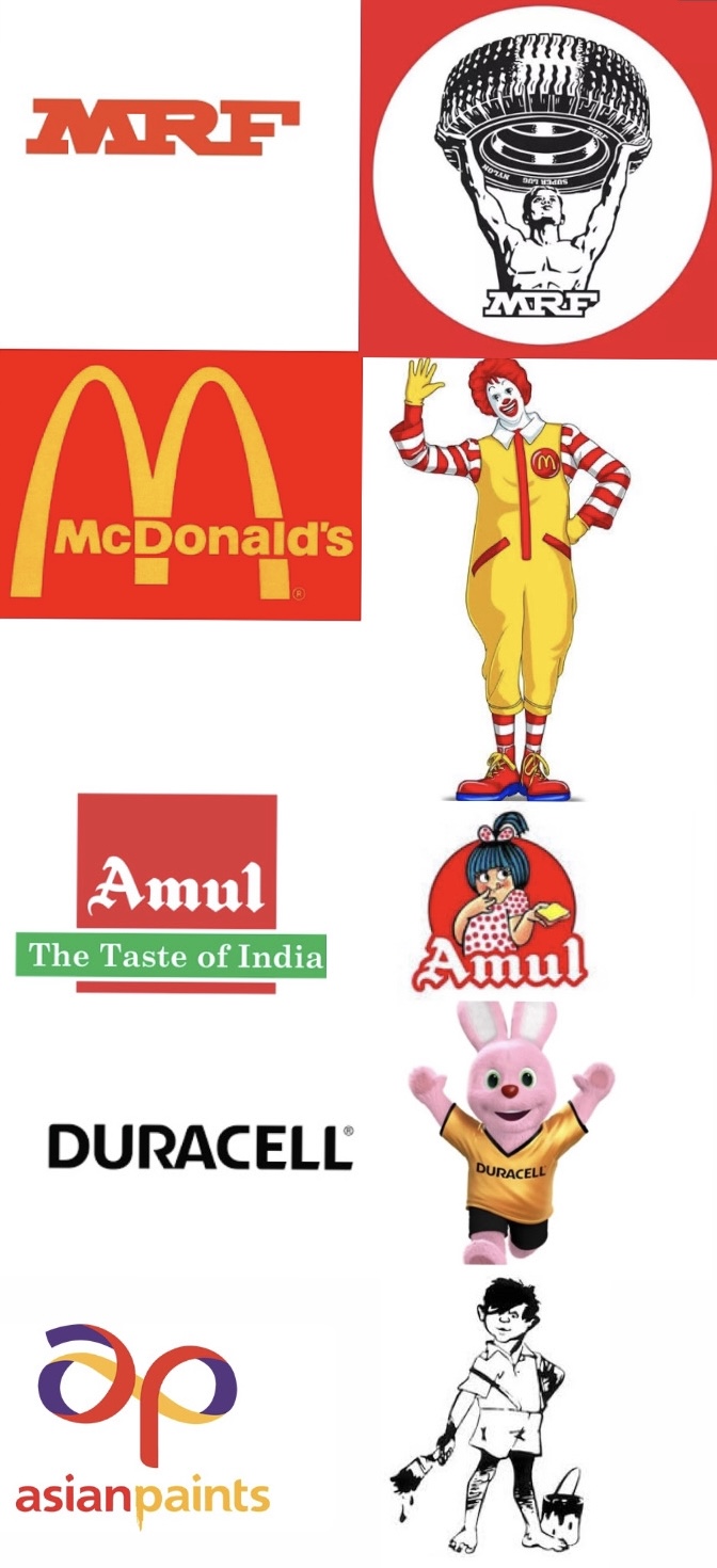
Let’s get this very clear. Maharaja is not the current Air India logo. It never was. At best you can call it a mascot. I would prefer to call it brand personification. Every mascot, be it the Asian Paint Gattu or the Amul girl or KFC Colonel Sanders or the Michelin man for Michelin Tyres were not brand logos but mascots. Amul’s logo is the way it writes Amul in a distinct registered typeface. McDonald’s logo is its famous M arch. But its mascot is the clown, Ronald McDonald which you will find outside its outlets. Duracell Bunny is its mascot. Not its logo.
Below are some examples of logos and some examples of mascot of the same brands.
So, what is the difference between the two and can they be used interchangeably?
Let’s dive in.
Simply put, the logo is the identity of the company. It’s a reminder of the brand or company. The name. The mascot defines the value, personality and sometimes even the culture of the company. In a way, a mascot is the extension of a logo. Many companies incorporate the logo in the mascot or make it a part of it. KFC is a good example of the same. So is the Duracell bunny.
Earlier, brands strived to have a mascot. Even in India, MRF had the muscle man. Cherry Charlie for Cherry Blossom shoe polish. Asian Paints Gattu. Air India Maharaja. These mascots told a story. They were the brand personified. Gattu was the personification of Asian Paints. It was a mischievous boy, maybe a brat who could not stop painting. And in old ads, Gattu painted anywhere. Even used a bald man’s pate. And the tag line that went with Gattu was ‘any surface that needs painting needs Asian Paints’.
In India, all these mascots worked because the also transcended the literacy barrier. Specially in rural areas Gattu, MRF Muscle man etc stood out as they identified a brand and also what the brand stood for.
But we must not forget that for all brands with a brand mascot, there were always two elements to play with. Twin identities. One was the brand logo. In many cases it was just the way the brand was written, with a tag line. And the second was the brand mascot. As media proliferation started and media started becoming more expensive with a premium on space or time, something had to give. Mostly, it was the mascot. Because the logo was the brand identity. Indispensable. And over a period of time most brand logos were just the way you write the brand. No separate design element also.
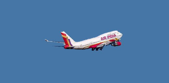
So, coming back to my initial question. What was the last Air India logo? And in categories like airlines, logos become more important because that’s what you see on the planes. The airlines is recognised by its logo. Air India also went through various logo transformations. I think its most famous logo was the centaur.
And its last logo, which is in current use, is the swan with the konark wheel inside it. Remember this?
The new design that Air India has released is therefore a replacement of the same. The vista along with the way Air India is going to be written now is the new logo of Air India. It is not replacing the Maharaja. For all you know, the brand may continue to use the Maharaja as a property in a limited way. Or maybe a different version of the Maharaja which imbibes the thinking behind the new logo.
I raise this point because I was dismayed to see not just marketing pundits but even national media announcing the death of the Maharaja when the new logo was unveiled. It may still happen. But it will not happen because a new logo has been designed. It’s not about a logo vs a mascot.
And let’s not forget another point. Logo is not just a design to be seen in isolation. Logo cannot be judged immediately just because of a design element. Logo is what the company makes of it. And it evolves, registers and rules, over a period of time.
The famous Nike swoosh. When Nike launched it, it was not exactly the current design but close to it. It evolved to what it is today. I am sure, if it was presented to the world then it would have met with outrage as a failed design. Nike was the name of the Greek goddess of victory. So, what had the swoosh to do with that? What Nike did over a period of time was identify the swoosh with its tagline, “Just do it”. Indeed, today the logo is so strongly identified with the brand that the brand name is not necessary when the logo of swoosh is around. Even Nike outlets today just have the swoosh logo outside. The brand name sometimes appears very discreetly in a small corner. Who would have thought of it, then? As I said, it’s what you make of the logo.
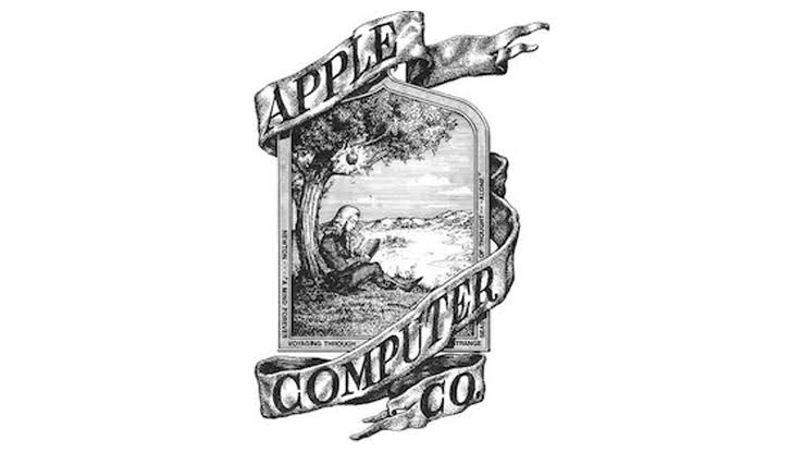
Or take Apple. Imagine calling a technology company with the name of a fruit. And that too a half-eaten one! But today, Apple is the ultimate in technology and design. And the Apple logo is ubiquitous. Indeed, it’s so famous that in India I have seen the logo being used by even a potato chip manufacturer and as a garment brand too. This logo also evolved and was used in an iconic way on its products too. The logo is so important that a cursory check on Amazon and Flipkart reveal that most of the iphone covers have a punch at the back which reveal the logo. Full covers or covers without the punch are not many. For, who would want to own a iPhone without flaunting its logo. I am also amused that Apple still gives in its product boxes 2 stickers of its logo. And people use it. On their laptop bags, back packs, indeed even on cars and scooters. Again, it’s what you make of the logo.
I would therefore not pass any judgment on the vista logo. It’s too early to make anything out of it. Even the critique that it’s not Indian is hollow. The brand is owned by a private company. It no more represents India. It’s as private or global as is British Airways or Air France. Why should it stick to representing India?
How will Tatas use the logo? Will they be more creative with it? Will they strive to make it standout? Or will they just let it be one anonymous airline logo? Indigo has done very well with its logo of the dots as a plane, its typeface and the colour indigo.

Indeed, even its airline code. It’s not 6E. It’s to be read as sexy. And all that has contributed to the brand personality. But that story is for another day.
The ball is now squarely in Air India’s court to make the new logo count.