Tag: dCell

  • DCell adds a festive sparkle to Britannia’s gifting range

    By A Correspondent


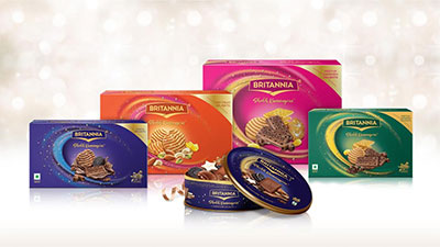
    Britannia Shubh Kamnayein has offered gift boxes to cater to all segments of society.


    Speaking about the brief to dCell, Vinay Subramanyam, Head Marketing, Britannia Industries Ltd said: “We wanted to create packs that personified and delivered to consumers, Britannia’s core thought of “Exciting Goodness”. Our gifting brand Britannia Shubh Kamnayein believes that festivities need to be part of everyday lives, and not just festivals. Our products are our key strength and many of our products are closely associated with beautiful experiences with friends and family. dCell, our design agency, has captured this thought beautifully on the pack. We are particularly pleased with the outcome which is a perfect balance of celebration, joy and a premium pack identity. We look forward to playing a small yet significant role in further enriching our consumers’ relationships.”


    Added dCell’s Unit Creative Director, Bhumika Shah: “Design has always been a key driver for change. While it’s been a privilege to be a part of Britannia Shubh Kamnayein’s journey, this year is special. India celebrates festivals with great gusto which brings alive a sense of togetherness and sharing gifts is a large part of it. This year Britannia’s gift packs are a testament to a new generation breeding inclusivity and equality. Our packaging design represents that through indulgent, celebratory graphics that capture the pride and joy of gifting. They break away from traditionally overused Diwali iconography. The dynamic glittering swirl encases the product shot, forming a window to the world of indulgent, delicious cookies and biscuits. We have styled the food shot to depict abundance as it flows out of the swirl creating a sense of depth and richness. The range of gift boxes is differentiated through vibrant colours, sparkling gold stars and foiling details giving them an eclectic festive look.”


  • Streax appoints dCell as design & packaging partner

    By A Correspondent


    Hair products major Streax has appointed dCell, the design and branding division of the Lowe Lintas group, to revitalise the packaging for its range of cream hair colour products.


    Said Bhumika Shah, Unit Creative Director, dCell: “dCell’s approach to branding always pivots on the larger brand story. We coined the phrase ‘Shine on’ as the product promise to reflect the brand’s enabling and encouraging role to further the aspirations and achievements of today’s confident woman”.


    Talking about the brief to dCell, Ashish Chhabra, Joint Managing Director, HRI, said: “If you look at the hair colour industry, it evolves and refreshes every 2 years. Our packaging identity was untouched for 3 years and needed to be updated. We felt it was time to up the fashion codes, and capture the richness and vibrancy of our new and improved cream hair colour formulation. We are very happy with the way dCell has infused glamour and confidence in the pack design and we hope our audiences love our new look and theirs too”.


  • Lowe Lintas and Golin Opinion bag creative and PR duties of Vaya Life

    By A Correspondent


    Startup Vaya Life has appointed Lowe Lintas Mumbai as its creative agency and Golin Opinion, as its Public Relations agency. The two agencies of the Mullen Lowe Lintas Group, India would work towards creating a seamless brand experience for Vaya Life by establishing the brand and helping it chart its unique growth path in the Indian market.


    Founded by Indian origin technologist, Vashist Vasanthakumar, Vaya Life envisions creating products that are designed to impact and improve everyday living.


    Vashist Vasanthakumar

    Commenting on the appointment, Vasanthakumar said, “Design is the core essence of brand Vaya. Interspersed with innovation and engineering, we aspire to build products which people not only use but love to be associated with. I am sure our association with Lowe Lintas and Golin Opinion, both leaders in their respective field, will help build the brand Vaya not only in India, but globally.  While Lintas has a rich legacy and strong credentials in building brands over the years, Golin Opinion’s  ability to service large conglomerates, their in-depth research orientation and diverse capabilities within the PR field is remarkable and I look forward to working together with them.”


    Anaheeta Goenka

    Said Anaheeta Goenka, President, Lowe Lintas Mumbai: “Vaya Life is among the new breed of start-ups that are seeking to redefine the category they operate in. We were inspired by their progressive growth plans and the inventive approach they have in mind for the Indian market. But what makes Vaya unique is that – here the fundamental core of technology & design is applied towards “improvements” on life’s little daily needs/products, often forgotten by everyone else. We are excited to partner them in all ways to engage and interest all Indians to choose a Vaya offering, creating brand effectiveness and brand love.”


    Ameer Ismail

    Commenting on the win, Ameer Ismail, Executive Director, Golin Opinion & dCell said, “We are excited to be working with Vaya Life. Delivering expertise assimilated with novelty and relevance is a key priority at Golin Opinion.”


  • dCell develops Visual Identity for Raw Pressery juices

    By A Correspondent


    dCell, the strategic design consultancy of Mullen Lowe Lintas Group, has developed the visual pack architecture for Raw Pressery’s benefit and classic range of juices. Cold-pressed juice brand Raw Pressery has been founded by entrepreneur Anuj Rakyan and is unique in the sense that its products are made from a combination of fruits, vegetables, nuts, spices and super foods without any heat or air thereby ensuring freshness for longer duration.


    Anuj Rakyan

    Commenting on the brief given to dCell, Anuj Rakyan, Founder and Managing Director of Raw Pressery said, “We wanted to create a master brand architecture for the benefits and our new classic range of juices to create a consistent, effective visual identity. With the new classic range, we wanted to reach out to a larger health conscious segment that often ends up being shortchanged by ‘100% juice’ brands. We’re excited with the creative output provided by dCell and wish the product gains popularity with the consumers as well.”


    Tasneem Ali

    Sharing the creative approach taken by the agency, Tasneem Ali, Executive Creative Director, dCell said, “Raw Pressery was taking a big leap from being a mostly online, home delivery based brand, to one where retail shelf presence is vital. Having a clear pet bottle in the universe of tetra packs is not just a differentiator on the shelf but gives an assurance of quality and purity, with plenty of taste appeal. As Raw Pressery has a loyal consumer base, we decided to build on what we felt had going for it. Retaining the original bold, simple, handcrafted logotype, we created a device holder to ensure the visibility of the logo on the various coloured juices. By linking the logo with the fruit graphic, we reinforced the brand promise to rely only on the fruit, and nothing else, to deliver on quality and taste. The free flowing illustration style is candid, uninhibited, honest, and true to the brand ‘Raw’.


    From the bottle format, to the logo and the illustration style, to the tone of voice of the back of pack copy and the way the information is presented, everything works in tandem to deliver the brand message: Raw Pressery is truly All Good, No Bad”.


    Started in 2013 by the former marketer as an experiment to fill the gaps in India’s health beverages market, RAW Pressery has become very popular among fitness enthusiasts who started consuming the cold-pressed apple, beetroot, ginger, carrot and lemon juices as detox drinks. Rakyan started the company in Mumbai through a home-subscription model before selling in supermarkets such as Foodhall, a chain of gourmet stores by Kishore Biyani’s Future Group.


    The company manages procurement, production and packaging in-house and the juices are available at Rs 55 onwards for Classic Range for 250 ml bottle and at Rs 150 for Benefit Blends for 250 ml bottle.


  • dCell unveils new brand identity for Aakriti Group

    By A Correspondent


    dCell, the strategic design consultancy division of Lowe Lintas + Partners, has successfully executed the re-branding of the AG8 Group back to its original name, Aakriti Group. Along with the name change, dCell was also instrumental in creating a new logo for Aakriti Group that resonates with the company’s belief of being future-ready.


    Aakriti Group is one of the fastest growing realty groups in India. The brief given to dCell was to create an identity that best represents Aakriti’s aspirations and work philosophy of always being there for its customers along their every step.


    Hemant Kumar

    Commenting on the brief given to dCell, Hemant Kumar, CMD, Aakriti Group said, “Though we had migrated to a new name just a few years back, there existed a strong residual emotional connect between our customers and the Aakriti name. Hence, it was only logical to go back to future. Furthermore, we needed an identity that best represents the group aspirations and work philosophy of always being there for our customers in every step.”


    Adding further Kumar said, “We were happy to partner with dCell who helped us in this re-branding project in a very strategic, logical and creative way delivering on all objectives set.”


    In the new logo unit, one of the ‘a’s in the wordmark has been crafted to create a brand shorthand. This represents the relationship Aakriti shares with its stakeholders/customers, a strong inseparable bond. This is metaphorically expressed via a shadow to the letter ‘a’. A round lowercase typeface is used to create a wordmark that is warm, approachable and welcoming.


    Arun Ahuja

    The colour system uses orange to lend vibrancy and represents optimism while grey symbolizes reliability, solidity, intelligence and innovation. Having the shorthand integrated within the logotype creates a unique, personalised logo with a strong personality that beautifully captures Aakriti’s work philosophy.


    Arun Ahuja, VP at dCell commented, “We have created a logo and a visual grammar that captures the people-centric philosophy that is at the very core of Aakriti’s ethos.”